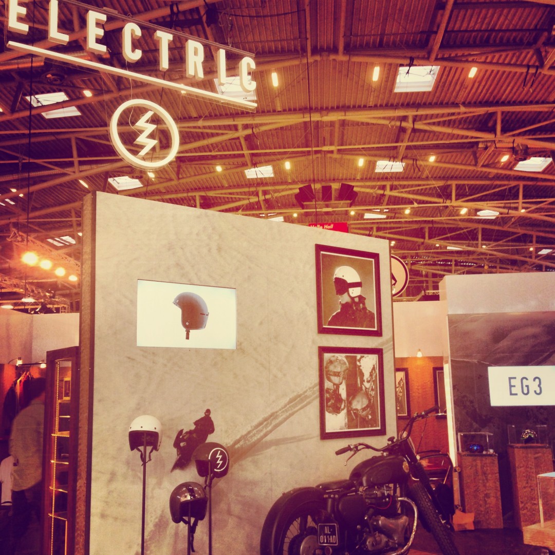
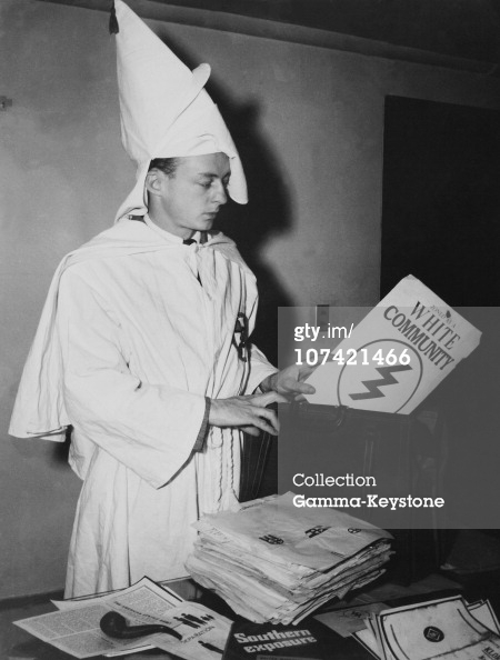
Electric launched a revised version of their logo a while back – really just a modernisation of their original, but with an unfortunately racist past. The logo is exactly like the one on the cover of a KKK publication, White Community, seen in the below photo from 1947 (is that a young Donald Sterling?). There’s no suggestion that the designer was actively looking to the Klan for inspiration or that the company deliberately did this for marketing purposes – no one could be that stupid. But it’s certainly an unfortunate coincidence. I think the original source on this is over here.
Hat tip to Boardistan.